For the past couple of days, this article by John Carlisle has been causing a bit of a stir on Twitter. The author claims that he has found statistical evidence that a surprisingly high proportion of randomised controlled trials (RCTs) contain data patterns that cannot have arisen by chance. Given that he has previously been instrumental in uncovering high-profile fraud cases, and also that he used data from articles that are known to be fraudulent (because they have been retracted) to calibrate his method, the implication is that some percentage of these impossible numbers are the result of fraud. The title of the article is provocative, too: "Data fabrication and other reasons for non-random sampling in 5087 randomised, controlled trials in anaesthetic and general medical journals". So yes, there are other reasons, but the implication is clear (and has been picked up by the media): There is a bit / some / a lot of data fabrication going on.
Because I anticipate that Carlisle's article is going to have quite an impact once more of the mainstream media decide to run with it, I thought I'd spend some time trying to understand exactly what Carlisle did. This post is a summary of what I've found out so far. I offer it in the hope that it may help some people to develop their own understanding of this interesting forensic technique, and perhaps as part of the ongoing debate about the limitations of such "post publication analysis" techniques (which also include things such as GRIM and statcheck).
[[Update 2017-06-12 19:35 UTC: There is now a much better post about this study by F. Perry Wilson here.]]
How Carlisle identified unusual patterns in the articles
Carlisle's analysis method was relatively simple. He examined the baseline differences between the groups in the trial on (most of) the reported continuous variables. These could be straightforward demographics like age and height, or they could be some kind of physiological measure taken at the start of the trial. Because participants have been randomised into these groups, any difference between them is (by definition) due to chance. Thus, we would expect a certain distribution of the p values associated with the statistical tests used to compare the groups; specifically, we would expect to see a uniform distribution (all p values are equally likely when the null hypothesis is true).
Not all of the RCTs report test statistics and/or p values for the difference between groups at baseline (it is not clear what a p value would mean, given that the null hypothesis is known to be true), but they can usually be calculated from the reported means and standard deviations. In his article, Carlisle gives a list of the R modules and functions that he used to reconstruct the test statistics and perform his other analyses.
Carlisle's idea is that, if the results have been fabricated (for example, in an extreme case, if the entire RCT never actually took place), then the fakers probably didn't pay too much attention to the p values of the baseline comparisons. After all, the main reason for presenting these statistics in the article is to show the reader that your randomisation worked and that there were no differences between the groups on any obvious confounders. So most people will just look at, say, the ages of the participants, and see that in the experimental condition the mean was 43.31 with an SD of 8.71, and in the control condition it was 42.74 with an SD of 8.52, and think "that looks pretty much the same". With 100 people in each condition, the p value for this difference is about .64, but we don't normally worry about that very much; indeed, as noted above, many authors wouldn't even provide a p value here.
Now consider what happens when you have ten baseline statistics, all of them fabricated. People are not very good at making up random numbers, and the fakers here probably won't even realise that as well as inventing means and SDs, they are also making up p values that ought to be uniformly distributed. So it is quite possible that they will make up mean/SD combinations that imply differences between groups that are either collectively too small (giving large p values) or too large (giving small p values).
Reproducing Carlisle's analyses
In order to better understand exactly what Carlisle did, I decided to reproduce a few of his analyses. I downloaded the online supporting information (two Excel files which I'll refer to as S1 and S2, plus a very short descriptive document) here. The Excel files have one worksheet per journal with the worksheet named NEJM (corresponding to articles published in the New England Journal of Medicine) being on top when you open the file, so I started there.
Carlisle's principal technique is to take the p values from the various baseline comparisons and combine them. His main way of doing this is with Stouffer's formula, which is what I've used in this post. Here's how that works:
1. Convert each p value into a z score.
2. Sum the z scores.
3. If there are k scores, divide the sum of the z scores from step 2 by the square root of k.
4. Calculate the one-tailed p value associated with the overall z score from step 3.
In R, that looks like this. Note that you just have to create the vector with your p values (first line) and then you can just copy/paste the second line, which implements the entire Stouffer formula.
That is, the p value associated with the test that these five p values arose by chance is .02. Now if we start suggesting that something is untoward based on the conventional significance threshold of .05 we're going to have a lot of unhappy innocent people, as Carlisle notes in his article (more than 1% of the articles he examined had a p value < .00001), so we can probably move on from this example quite rapidly. On the other hand, if you have a pattern like this in your baseline t tests:
then things are starting to get interesting. Remember that the p values should be uniformly distributed from 0 to 1, so we might wonder why all but one of them are above .50.
In Carlisle's model, suspicious distributions are typically those with too many high p values (above 0.50) or too many low ones, which give overall p values that are close to either 0 or 1, respectively. For example, if you subtract all five of the p values in the first list I gave above from 1, you get this:
and if you subtract that final p value from 1, you get the value of 0.0211038 that appears above.
To reduce the amount of work I had to do, I chose three articles that were near the top of the NEJM worksheet in the S1 file (in principle, the higher up the worksheet the study is, the bigger the problems) and that had not too many variables in them. I have not examined any other articles at this time, so what follows is a report on a very small sample and may not be representative.
Article 1
The first article I chose was by Jonas et al. (2002), "Clinical Trial of Lamivudine in Children with Chronic Hepatitis B", which is on line 8 of the NEJM worksheet in the S1 file. The trial number (cell B8 of the NEJM worksheet in the S1 file) is given as 121, so I next looked for this number in column A of the NEJM worksheet of the S2 file and found it on lines 2069 through 2074. Those lines allow us to see exactly which means and SDs were extracted from the article and used as the basis for the calculations in the S1 file. (The degree to which Carlisle has documented his analyses is extremely impressive.) In this case, the means and SDs correspond to the three baseline variables reported in Table 1 of Jonas et al.'s article:
 By combining the p values from these variables, Carlisle arrived at an overall inverted (see p. 4 of his article) p value of .99997992. This needs to be subtracted from 1 to give a conventional p value, which in this case is .00002. That would appear to be very strong evidence against the null hypothesis that these numbers are the product of chance. However, there are a couple of problems here.
First, Carlisle made the following note in the S1 file (cell A8):
Second, and much more importantly, the three baseline variables here are clearly not independent. The first set of numbers ("Total score") is merely the sum of the other two, and arguably these other two measures of liver deficiencies are quite likely to be related to one another. Even if we ignore that last point and only remove "Total score", considering the other two variables to be completely independent, the overall p value for this RCT would change from .00002 to .001.
Carlisle discusses the general issue of non-independence on p. 7 of his article, and in the quote above he actually noted that the liver function scores in Jonas et al. were correlated. That makes it slightly unfortunate that he didn't take some kind of measures to compensate for the correlation. Leaving the raw numbers in the S1 file as if the scores were uncorrelated meant that Jonas et al.'s article appeared to be the seventh most severely problematic article in NEJM.
(* Update 2017-06-08 10:07 UTC: In the first version of this post, I wrote "it is slightly unfortunate that [Carlisle] apparently didn't spot the problem in this case". This was unfair of me, as the quote from the S1 file shows that Carlisle did indeed spot that the variables were correlated.)
Article 2
Looking further down file S1 for NEJM articles with only a few variables, I came across Glauser et al. (2010), "Ethosuximide, Valproic Acid, and Lamotrigine in Childhood Absence Epilepsy" on line 12. This has just two baseline variables for participants' IQs measured with two different instruments. The trial number is 557, which leads us to lines 10280 through 10285 of the NEJM worksheet in the S2 file. Each of the two variables has three values, corresponding to the three treatment groups.
Carlisle notes in his article (p. 7) that the p value for the one-way ANOVA comparing the groups for the second variable is misreported. The authors stated that this value is .07, whereas Carlisle calculates (and I concur, using ind.twoway.second() from the rpsychi package in R) that this should be around .0000007. Combining this p value with the .47 from the first variable, Carlisle obtains an overall (conventional) p value of .0004 to test the null hypothesis that these group differences are the result of chance.

But it seems to me that there may be a more parsimonious explanation for these problems. The two baseline variables are both measures of IQ, and one would expect them to be correlated. Inspection of the group means in Glauser et al.'s Table 2 (a truncated version of which is show above) suggests that the value for the Lamotrigine group on the WPPSI measure is a lot lower than might be expected, given that this group scored slightly higher on the WISC measure. Indeed, when I replaced the value of 92.0 with 103.0, I obtained a p value for the one-way ANOVA of almost exactly .07. Of course, there is no direct evidence that 92.0 was the result of a finger slip (or, perhaps, copying the wrong number from a printed table), but it certainly seems like a reasonable possibility. A value of 96.0 instead of 92.0 would also give a p value close to .07.
Article 3
Continuing down the NEJM worksheet in the S1 file, I came to Heydendael et al. (2003) "Methotrexate versus Cyclosporine in Moderate-to-Severe Chronic Plaque Psoriasis" on line 33. Here there are three baseline variables, described on lines 3152 through 3157 of the NEJM worksheet in the S2 file. These variables turn out to be the patient's age at the start of the study, the extent of their psoriasis, and the age at which psoriasis first developed, as shown in Table 1, which I've reproduced here.
 Carlisle apparently took the authors at their word that the numbers after the ± symbol were standard errors, as he seems to have converted them to standard deviations by multiplying them by the square root of the sample size (cells F3152 through F3157 in the S2 file). However, it seems clear that, at least in the case of the ages, the "SEs" can only have been SDs. The values calculated by Carlisle for the SDs are around 80, which is an absurd standard deviation for human ages; in contrast, the values ranging from 12.4 through 14.5 in the table shown above are quite reasonable as SDs. It is not clear whether the "SE" values in the table for the psoriasis area-and-severity index are in fact likely to be SDs, or whether Carlisle's calculated SD values (23.6 and 42.8, respectively) are more likely to be correct.
Carlisle calculated an overall p value of .005959229 for this study. Assuming that the SDs for the age variables are in fact the numbers listed as SEs in the above table, I get an overall p value of around .79 (with a little margin for error due to rounding error on the means and SDs, which are given to only one decimal place).
Conclusion
The above analyses show how easy it can be to misinterpret published articles when conducting systematic forensic analyses. I can't know what was going through Carlisle's mind when he was reading the articles that I selected to check, but having myself been through the exercise of reading several hundred articles over the course of a few evenings looking for GRIM problems, I can imagine that obtaining a full understanding of the relations between each of the baseline variables may not always have been possible.
I want to make it very clear that this post is not intended as a "debunking" or "takedown" of Carlisle's article, for several reasons. First, I could have misunderstood something about his procedure (my description of it in this post is guaranteed to be incomplete). Second, Carlisle has clearly put a phenomenal amount of effort—thousands of hours, I would guess—into these analyses, for which he deserves a vast amount of credit (and does not deserve to be the subject of nitpicking). Third, Carlisle himself noted in his article (p. 8) that is was inevitable that he had made a certain number of mistakes. Fourth, I am currently in a very similar line of business myself at least part of the time, with GRIM and the Cornell Food and Brand Lab saga, and I know that I have made multiple errors, sometimes in public, where I was convinced that I had found a problem and someone gently pointed out that I had missed something (and that something was usually pretty straightforward). I should also point out that the quotes around the word "bombshell" in the title of this post are not meant to belittle the results of Carlisle's article, but merely to indicate that this is how some media outlets will probably refer to it (using a word that I try to avoid like the plague).
If I had a takeaway message, I think it would be that this technique of examining the distribution of p values from baseline variable comparisons is likely to be less reliable as a predictor of genuine problems (such as fraud) when the number of variables is small. In theory the overall probability that the results are legitimate and correctly reported is completely taken care of by the p values and Stouffer's formula for combining them, but in practice when there are only a few variables it only takes a small issue—such as a typo, or some unforeseen non-independence—to distort the results and make it appear as if there is something untoward when there probably isn't.
I would also suggest that when looking for fabrication, clusters of small p values—particularly those below .05—may not be as good an indication as clusters of large p values. This is just a continuation of my argument about the p value of .07 (or .0000007) from Article 2, above. I think that Carlisle's technique is very clever and will surely catch many people who do not realise that their "boring" numbers showing no difference will produce p values that need to follow a certain distribution, but I question whether many people are fabricating data that (even accidentally) shows a significant baseline difference between groups, when such differences might be likely to attract the attention of the reviewers.
To conclude: One of the reasons that science is hard is that it requires a lot of attention to detail, which humans are not always very good at it. Even people who are obviously phenomenally good at it (including John Carlisle!) make mistakes. We learned when writing our GRIM article what an error-prone process the collection and analysis of data can be, whether this be empirical data gathered from subjects (some of the stories about how their data were collected or curated that were volunteered by the authors whom we contacted to ask for their datasets were both amusing and slightly terrifying) or data extracted from published articles for the purposes of meta-analysis or forensic investigation. I have a back burner project to develop a "data hygiene" course, and hope to get round to actually writing and giving it one day!
Because I anticipate that Carlisle's article is going to have quite an impact once more of the mainstream media decide to run with it, I thought I'd spend some time trying to understand exactly what Carlisle did. This post is a summary of what I've found out so far. I offer it in the hope that it may help some people to develop their own understanding of this interesting forensic technique, and perhaps as part of the ongoing debate about the limitations of such "post publication analysis" techniques (which also include things such as GRIM and statcheck).
[[Update 2017-06-12 19:35 UTC: There is now a much better post about this study by F. Perry Wilson here.]]
How Carlisle identified unusual patterns in the articles
Carlisle's analysis method was relatively simple. He examined the baseline differences between the groups in the trial on (most of) the reported continuous variables. These could be straightforward demographics like age and height, or they could be some kind of physiological measure taken at the start of the trial. Because participants have been randomised into these groups, any difference between them is (by definition) due to chance. Thus, we would expect a certain distribution of the p values associated with the statistical tests used to compare the groups; specifically, we would expect to see a uniform distribution (all p values are equally likely when the null hypothesis is true).
Not all of the RCTs report test statistics and/or p values for the difference between groups at baseline (it is not clear what a p value would mean, given that the null hypothesis is known to be true), but they can usually be calculated from the reported means and standard deviations. In his article, Carlisle gives a list of the R modules and functions that he used to reconstruct the test statistics and perform his other analyses.
Carlisle's idea is that, if the results have been fabricated (for example, in an extreme case, if the entire RCT never actually took place), then the fakers probably didn't pay too much attention to the p values of the baseline comparisons. After all, the main reason for presenting these statistics in the article is to show the reader that your randomisation worked and that there were no differences between the groups on any obvious confounders. So most people will just look at, say, the ages of the participants, and see that in the experimental condition the mean was 43.31 with an SD of 8.71, and in the control condition it was 42.74 with an SD of 8.52, and think "that looks pretty much the same". With 100 people in each condition, the p value for this difference is about .64, but we don't normally worry about that very much; indeed, as noted above, many authors wouldn't even provide a p value here.
Now consider what happens when you have ten baseline statistics, all of them fabricated. People are not very good at making up random numbers, and the fakers here probably won't even realise that as well as inventing means and SDs, they are also making up p values that ought to be uniformly distributed. So it is quite possible that they will make up mean/SD combinations that imply differences between groups that are either collectively too small (giving large p values) or too large (giving small p values).
Reproducing Carlisle's analyses
In order to better understand exactly what Carlisle did, I decided to reproduce a few of his analyses. I downloaded the online supporting information (two Excel files which I'll refer to as S1 and S2, plus a very short descriptive document) here. The Excel files have one worksheet per journal with the worksheet named NEJM (corresponding to articles published in the New England Journal of Medicine) being on top when you open the file, so I started there.
Carlisle's principal technique is to take the p values from the various baseline comparisons and combine them. His main way of doing this is with Stouffer's formula, which is what I've used in this post. Here's how that works:
1. Convert each p value into a z score.
2. Sum the z scores.
3. If there are k scores, divide the sum of the z scores from step 2 by the square root of k.
4. Calculate the one-tailed p value associated with the overall z score from step 3.
In R, that looks like this. Note that you just have to create the vector with your p values (first line) and then you can just copy/paste the second line, which implements the entire Stouffer formula.
plist = c(.95, .84, .43, .75, .92)
1 - pnorm(sum(sapply(plist, qnorm))/sqrt(length(plist)))
[1] 0.02110381
That is, the p value associated with the test that these five p values arose by chance is .02. Now if we start suggesting that something is untoward based on the conventional significance threshold of .05 we're going to have a lot of unhappy innocent people, as Carlisle notes in his article (more than 1% of the articles he examined had a p value < .00001), so we can probably move on from this example quite rapidly. On the other hand, if you have a pattern like this in your baseline t tests:
plist = c(.95, .84, .43, .75, .92, .87, .83, .79, .78, .84)
1 - pnorm(sum(sapply(plist, qnorm))/sqrt(length(plist)))
[1] 0.00181833
then things are starting to get interesting. Remember that the p values should be uniformly distributed from 0 to 1, so we might wonder why all but one of them are above .50.
In Carlisle's model, suspicious distributions are typically those with too many high p values (above 0.50) or too many low ones, which give overall p values that are close to either 0 or 1, respectively. For example, if you subtract all five of the p values in the first list I gave above from 1, you get this:
plist = c(.05, .16, .57, .25, .08)
1 - pnorm(sum(sapply(plist, qnorm))/sqrt(length(plist)))
[1] 0.9788962
and if you subtract that final p value from 1, you get the value of 0.0211038 that appears above.
To reduce the amount of work I had to do, I chose three articles that were near the top of the NEJM worksheet in the S1 file (in principle, the higher up the worksheet the study is, the bigger the problems) and that had not too many variables in them. I have not examined any other articles at this time, so what follows is a report on a very small sample and may not be representative.
Article 1
The first article I chose was by Jonas et al. (2002), "Clinical Trial of Lamivudine in Children with Chronic Hepatitis B", which is on line 8 of the NEJM worksheet in the S1 file. The trial number (cell B8 of the NEJM worksheet in the S1 file) is given as 121, so I next looked for this number in column A of the NEJM worksheet of the S2 file and found it on lines 2069 through 2074. Those lines allow us to see exactly which means and SDs were extracted from the article and used as the basis for the calculations in the S1 file. (The degree to which Carlisle has documented his analyses is extremely impressive.) In this case, the means and SDs correspond to the three baseline variables reported in Table 1 of Jonas et al.'s article:

First, Carlisle made the following note in the S1 file (cell A8):
Patients were randomly assigned. Variables correlated (histologic scores). Supplementary baseline data reported as median (range). p values noted by authors.But in cells O8, P8, and Q8, he gives different p values from those in the article, which I presume he calculated himself. After subtracting these p values from 1 (to take into account the inversion of the input p values that Carlisle describes on p. 4 of his article), we can see that the third p value in cell Q8 is rather different (.035 has become approximately .10). It appears that the original p values were derived from a non-parametric test which would be impossible to reproduce without the data, so presumably Carlisle assumed a parametric model (for example, p values can be calculated for a t test from the mean, SD, and sample sizes of the two groups). Note that in this case, the difference in p values actually works against a false positive, but the general point is that not all p value analyses can be reproduced from the summary statistics.
Second, and much more importantly, the three baseline variables here are clearly not independent. The first set of numbers ("Total score") is merely the sum of the other two, and arguably these other two measures of liver deficiencies are quite likely to be related to one another. Even if we ignore that last point and only remove "Total score", considering the other two variables to be completely independent, the overall p value for this RCT would change from .00002 to .001.
plist = c(0.997916597, 0.998464969, 0.900933333)
1 - pnorm(sum(sapply(plist, qnorm))/sqrt(length(plist)))
[1] 2.007969e-05
plist = c(0.998464969, 0.900933333)     #omitting "Total score"
1 - pnorm(sum(sapply(plist, qnorm))/sqrt(length(plist)))
[1] 0.001334679
Carlisle discusses the general issue of non-independence on p. 7 of his article, and in the quote above he actually noted that the liver function scores in Jonas et al. were correlated. That makes it slightly unfortunate that he didn't take some kind of measures to compensate for the correlation. Leaving the raw numbers in the S1 file as if the scores were uncorrelated meant that Jonas et al.'s article appeared to be the seventh most severely problematic article in NEJM.
(* Update 2017-06-08 10:07 UTC: In the first version of this post, I wrote "it is slightly unfortunate that [Carlisle] apparently didn't spot the problem in this case". This was unfair of me, as the quote from the S1 file shows that Carlisle did indeed spot that the variables were correlated.)
Article 2
Looking further down file S1 for NEJM articles with only a few variables, I came across Glauser et al. (2010), "Ethosuximide, Valproic Acid, and Lamotrigine in Childhood Absence Epilepsy" on line 12. This has just two baseline variables for participants' IQs measured with two different instruments. The trial number is 557, which leads us to lines 10280 through 10285 of the NEJM worksheet in the S2 file. Each of the two variables has three values, corresponding to the three treatment groups.
Carlisle notes in his article (p. 7) that the p value for the one-way ANOVA comparing the groups for the second variable is misreported. The authors stated that this value is .07, whereas Carlisle calculates (and I concur, using ind.twoway.second() from the rpsychi package in R) that this should be around .0000007. Combining this p value with the .47 from the first variable, Carlisle obtains an overall (conventional) p value of .0004 to test the null hypothesis that these group differences are the result of chance.

But it seems to me that there may be a more parsimonious explanation for these problems. The two baseline variables are both measures of IQ, and one would expect them to be correlated. Inspection of the group means in Glauser et al.'s Table 2 (a truncated version of which is show above) suggests that the value for the Lamotrigine group on the WPPSI measure is a lot lower than might be expected, given that this group scored slightly higher on the WISC measure. Indeed, when I replaced the value of 92.0 with 103.0, I obtained a p value for the one-way ANOVA of almost exactly .07. Of course, there is no direct evidence that 92.0 was the result of a finger slip (or, perhaps, copying the wrong number from a printed table), but it certainly seems like a reasonable possibility. A value of 96.0 instead of 92.0 would also give a p value close to .07.
xsd = c(16.6, 14.5, 14.8)
xn = c(155, 149, 147)
an1 = ind.oneway.second(m=c(99.1, 92.0, 100.0), sd=xsd, n=xn)
an1$anova.table$F[1]
[1] 12.163
1 - pf(q=12.163, df1=2, df2=448)
[1] 7.179598e-06
an2 = ind.oneway.second(m=c(99.1, 103.0, 100.0), sd=xsd, n=xn)
an2$anova.table$F[1]
[1] 2.668
1 - pf(q=2.668, df1=2, df2=448)
[1] 0.0704934
It also seems slightly strange that someone who was fabricating data would choose to make up this particular pattern. After having invented the numbers for the WISC measure, one would presumably not add a few IQ points to two of the values and subtract a few from the other, thus inevitably pushing the groups further apart, given that the whole point of fabricating baseline IQ data would be to show that the randomisation had succeeded; to do the opposite would seem to be very sloppy. (However, it may well be the case that people who feel the need to fabricate data are typically not especially intelligent and/or statistically literate; the reason that there are very few "criminal masterminds" is that most masterminds find a more honest way to earn a living.)
Article 3
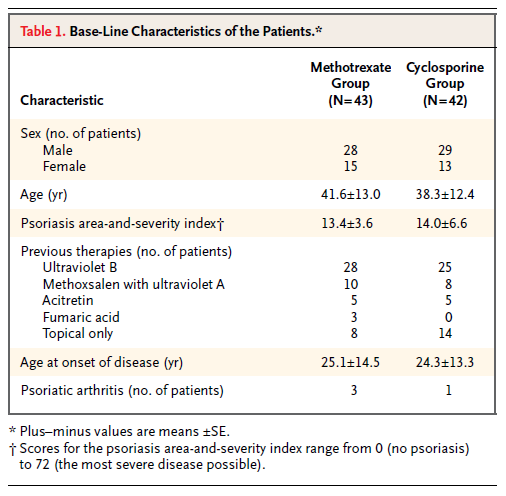
Continuing down the NEJM worksheet in the S1 file, I came to Heydendael et al. (2003) "Methotrexate versus Cyclosporine in Moderate-to-Severe Chronic Plaque Psoriasis" on line 33. Here there are three baseline variables, described on lines 3152 through 3157 of the NEJM worksheet in the S2 file. These variables turn out to be the patient's age at the start of the study, the extent of their psoriasis, and the age at which psoriasis first developed, as shown in Table 1, which I've reproduced here.

Carlisle calculated an overall p value of .005959229 for this study. Assuming that the SDs for the age variables are in fact the numbers listed as SEs in the above table, I get an overall p value of around .79 (with a little margin for error due to rounding error on the means and SDs, which are given to only one decimal place).
xn = c(43, 42)
an1 = ind.oneway.second(m=c(41.6, 38.3), sd=c(13.0, 12.4), n=xn)
an1$anova.table$F[1]
[1] 1.433
1 - pf(q=1.433, df1=1, df2=83)
[1] 0.2346833
an2 = ind.oneway.second(m=c(25.1, 24.3), sd=c(14.5, 13.3), n=xn)
an2$anova.table$F[1]
[1] 0.07
1 - pf(q=0.07, df1=1, df2=83)
[1] 0.7919927 1 - pf(q=0.07, df1=1, df2=83)
# Keep value for psoriasis from cell P33 of S1 file
plist = c(0.2346833, 0.066833333, 0.7919927)
1 - pnorm(sum(sapply(plist, qnorm))/sqrt(length(plist)))
[1] 0.7921881
The fact that Carlisle apparently did not spot this issue is slightly ironic given that he wrote about the general problem of confusion between standard deviations and standard errors in his article (pp. 5–6) and also included comments about possible mislabelling by authors of SDs and SEs in several of the notes in column A of the S1 spreadsheet file.
Conclusion
The above analyses show how easy it can be to misinterpret published articles when conducting systematic forensic analyses. I can't know what was going through Carlisle's mind when he was reading the articles that I selected to check, but having myself been through the exercise of reading several hundred articles over the course of a few evenings looking for GRIM problems, I can imagine that obtaining a full understanding of the relations between each of the baseline variables may not always have been possible.
I want to make it very clear that this post is not intended as a "debunking" or "takedown" of Carlisle's article, for several reasons. First, I could have misunderstood something about his procedure (my description of it in this post is guaranteed to be incomplete). Second, Carlisle has clearly put a phenomenal amount of effort—thousands of hours, I would guess—into these analyses, for which he deserves a vast amount of credit (and does not deserve to be the subject of nitpicking). Third, Carlisle himself noted in his article (p. 8) that is was inevitable that he had made a certain number of mistakes. Fourth, I am currently in a very similar line of business myself at least part of the time, with GRIM and the Cornell Food and Brand Lab saga, and I know that I have made multiple errors, sometimes in public, where I was convinced that I had found a problem and someone gently pointed out that I had missed something (and that something was usually pretty straightforward). I should also point out that the quotes around the word "bombshell" in the title of this post are not meant to belittle the results of Carlisle's article, but merely to indicate that this is how some media outlets will probably refer to it (using a word that I try to avoid like the plague).
If I had a takeaway message, I think it would be that this technique of examining the distribution of p values from baseline variable comparisons is likely to be less reliable as a predictor of genuine problems (such as fraud) when the number of variables is small. In theory the overall probability that the results are legitimate and correctly reported is completely taken care of by the p values and Stouffer's formula for combining them, but in practice when there are only a few variables it only takes a small issue—such as a typo, or some unforeseen non-independence—to distort the results and make it appear as if there is something untoward when there probably isn't.
I would also suggest that when looking for fabrication, clusters of small p values—particularly those below .05—may not be as good an indication as clusters of large p values. This is just a continuation of my argument about the p value of .07 (or .0000007) from Article 2, above. I think that Carlisle's technique is very clever and will surely catch many people who do not realise that their "boring" numbers showing no difference will produce p values that need to follow a certain distribution, but I question whether many people are fabricating data that (even accidentally) shows a significant baseline difference between groups, when such differences might be likely to attract the attention of the reviewers.
To conclude: One of the reasons that science is hard is that it requires a lot of attention to detail, which humans are not always very good at it. Even people who are obviously phenomenally good at it (including John Carlisle!) make mistakes. We learned when writing our GRIM article what an error-prone process the collection and analysis of data can be, whether this be empirical data gathered from subjects (some of the stories about how their data were collected or curated that were volunteered by the authors whom we contacted to ask for their datasets were both amusing and slightly terrifying) or data extracted from published articles for the purposes of meta-analysis or forensic investigation. I have a back burner project to develop a "data hygiene" course, and hope to get round to actually writing and giving it one day!
